An article in today’s New York Times, by Sabrina Tavernise, is entitled As College Grads Cluster, Some Cities Are Left Behind. A lot of old US cities with economies that used to be based on manufacturing are having trouble making the transition to our current, post-manufacturing economy. And one difficulty such cities face is a lack of college graduates.
Historically, most American cities had relatively similar shares of college graduates, in part because fewer people went to college. In 1970, the difference between the most-educated and least-educated cities, in terms of the portion of residents with four-year degrees, was 16 percentage points, and nearly all metro areas were within 5 points of the average. Today the spread is double that, and only half of all metro areas are within 5 points of the average, the Brookings research shows.
But what does “relatively similar” mean here? The proportion of adults in metropolitan areas that have college degrees, according to the accompanying infographic, has risen from 12% in 1970 to 32% in 2010. I would guess that a city with, say, 9% college graduates in 1970 is comparable to a city with 24% college graduates in 2010 — both have three-fourths of the average.
(Admittedly this doesn’t hold up if the percentages are quite large. For example, let’s say we’re looking at literacy rates; I’d say that a metropolitan area having 40% literacy in a time when the national rate is 50% is relatively better off than a state having 76% literacy when the national rate is 95%. But bear with me.)
Indeed, from the infographic you can also get the actual distribution of the percentage of college graduates in each of the metro areas in question. (The study includes 100 metro areas in each of 1970 and 2010.) In 1970 the average metropolitan area had 11.5 percent college graduates, with SD 2.9 percent; the standard deviation is 25 percent of the mean. In 2010 the average metropolitan area had 29.4 percent college graduates, with SD 6.2 percent; the standard deviation is 21 percent of the mean. In these terms, the disparity has gotten smaller!
So let’s normalize the share for every metropolitan area by comparing to the average. In 1970, for example, Washington, DC had 22.1% college graduates, compared to the average of 11.5%, so it had 1.92 times the average. In 2010, Washington, DC had 46.8% college graduates, compared to the average of 29.4%, so it had 1.59 times the average. In this respect it looks like Washington is getting more like the US, not less. (Washington was the most college-degreed metropolitan area, in both samples, which presumably has something to do with its dominant industry being government.)
If we make histograms of these normalized shares for 1970 and 2010 and superimpose them, we get the plot below. Black is 1970, red is 2010. The distribution gets narrower, not wider, as time passes when viewed on this scale.

I don’t mean to take away from the fact that this disparity exists between metropolitan areas. But the real problem is probably not so much that the educational disparity is growing as that the returns to a college education are larger with the departure of manufacturing jobs.
Matt Yglesias has commented on this from an economic point of view, echoing some points that Enrico Moretti makes in The New Geography of Jobs. In particular, what’s the point of states funding public education if people are just going to move away from those states?
Edited to add, 4:49 pm: Junk Charts comments on the graphic itself.

Superb, Michael.
What’s the right normalization in general? It can’t be straight proportion. If, in 2030, 60% of US adults are college graduates, then it would be slightly say “Washington DC is getting more like the rest of the country” on the grounds that it didn’t have 1.92*60% college graduates.
Jordan, I don’t actually know what’s “right” here. The logit feels like it might be right (followed by taking differences instead of quotients). In this case is mapped to
  , For small
  you have
  , and so for small
  and
and  you have
 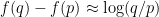 .
.
So, for example, the distance between 1% and 2% is (this is just barely over log 2); this is the same as the distance between 5% and 9.6%, or 20% and 33%, or 50% and 67%, or 80% and 89%, or 98% and 99%, to name a few.
If you apply the logit function to the data, then the standard deviation has gone up, but not by much. If you take the logits of the 100 percentages for 1970 and then take the SD of that set, you get about 0.27; doing the same compuation in 2010 gives 0.31. Washington goes from being 0.78 above the average to 0.75, but we really shouldn’t just look at a single data point.
In the end your question is more psychological than mathematical, though, so I’m not sure the two of us can answer it…
Well, I too wanted to apply some standard transformation from [0,1] to [-oo,oo]; the logit seems as good as any. I would guess that any “reasonably shaped” transform is close enough to logit that you’d end up not seeing any noticeable change in the inequality of baccalaureate distribution between 1970 and the present.
The logit also has the nice property that for small p it reduces to the criterion implicit in my original post. The probit, for example, wouldn’t do that.