Pairs of cities with the same population

I was looking at the list of US cities by population on Wikipedia yesterday, because I noticed that Sunnyvale, a suburb of San Jose that I had occasion to go to yesterday, had a surprisingly large population of 140,095. There are a lot of places like this in California — despite having about 12% of US population, it has 64 of the 275 largest cities (all those with population above 100,000), or about 23%.

And among those 275 cities there are three pairs with the same population in the 2010 Census:

  • Fargo, North Dakota and Norwalk, California, both at 105,549
  • Arvada, Colorado and Ventura, California, both at 106,433
  • Aurora, Illinois and Oxnard, California, both at 197,899

Of course census data shouldn’t actually be taken to be exact. But how many pairs like this would we expect?

The starting point here is Zipf’s law for cities, or the rank-size rule. This rule states that the nth largest city in a region will have population 1/n times that of the largest city. As it turns out, this isn’t quite true for the structure of cities in the US, but they do roughly follow a power law. If we regress log(population) against log(rank), we get the regression line

\log(pop) = 15.6103 - 0.7287 \log(rank)

or, if we exponentiate both sides,

pop = 6018207 \times rank^{-.7287}

For example, we predict that the hundredth-largest city should have population 6018207 \times 100^{-0.7287} = 209926. The actual hundredth-largest city is Spokane, Washington, with population 208916. See below for a graph of city size vs. city rank:

Because I don’t want to rewrite these numbers over and over, I’m going to rewrite that as p = a r^{-b}, and plug in the numbers at the end. Now let’s invert this relationship. How many cities do we expect to have population greater than some constant p? That’s just the rank the corresponds to p;. Solving for r gives r = (p/a)^{-1/b}. Let’s write this as $r = f(p)$.

The expected number of cities having population exactly p is thern

-f^\prime(p) = a^{1/b} {1 \over b} p^{-(1+1/b)}

Taking the derivative here is actually the crux of the analysis, so I’ll elaborate a bit. The expected number of cities having population at least p is f(p); the expected number of cities having population at least p+1 is f(p+1). The expected number of cities having population exactly p, then, is f(p)-f(p+1) = -(f(p+1) - f(p)). But f(p) varies slowly so we can approximate f(p+1) - f(p) by f^\prime(p). Let g(p) = -f^\prime(p) for later ease of notation.

Roughly speaking, g(p) is the density of cities per unit population, at p. For example, if we let p = 105,000 we get that we expect 0.0034 cities of population 105,000. Extrapolating to the range from 100,000 to 110,000, we expect 10,000 times this many cities, or 34, in that population range; there are in fact 39.

So now take this expected value, and figure that the actual number of cities of population p is a Poisson random variable with mean g(p). The probability that such a random variable is equal to 2 is e^{-g(p)} g(p)^2/2. Since g(p) is very close to 0, I’ll drop the exponential term in what follows. Furthermore for ease of calculation, let’s assume these Poissons are never greater than 2. For example, the probability that a Poisson with mean 0.0034 is at least 2 is exactly

1 - e^{0.0034} (1 + 0.0034) \approx 5.767 \times 10^{-6}

and I use the approximation 0.0034^2/2 = 5.78 \times 10^{-6}. The number of pairs of cities with population greater than c and the same population is then predicted to be

\sum_{p \ge c} g(p)^2/2

but I’d rather do an integral instead of a sum, so we’ll approximate this as

\int_{c}^\infty g(p)^2/2 \: dp.

Recalling that g(p) = a^{1/b}/b p^{-(1+1/b)}, we get

\int_c^\infty {a^{2/b} \over 2b^2} p^{-(2+2/b)} \: dp

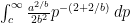
and doing the integral gives

{a^{2/b} \over 2b^2} {b \over b+2} c^{-(1+2/b)}

Plugging in the values from above, c = 100000, a = 6018207, b = 0.7287, gives 0.1924. So the expected number of such coincidences is about one-fifth; in the 2010 census it was three.

If you compare data from 2000 the first such coincidence is at rank 467 – Royal Oak, MI and Bristol, CT both had population 60,062 that year. (Note: I scanned the data by eye, so it’s possible I missed something.) You expect to start seeing coincidences this far down; plugging in c = 60000 with the 2010 coefficients gives 1.3. (Properly speaking I should use the 2000 coefficients, but I’d have to compute them first.) So 2010 is probably unusual. Still, I can’t help but suspect that the Census might be fudging the data a little bit to make these cities tie so that the lower-ranked member of each couplet doesn’t complain…

I’m looking for a job, in the SF Bay Area. See my linkedin profile.

Weekly links for June 24

Sir Timothy Gowers.

Black bears have some numerical ability.

From Josh Laurito, How similar are European languages to each other? Unfortunately does not include the language(s) that I’ve heard referred to as “BCS” or, somewhat more crudely, “Bosnifuckit”. That’s “Bosnian/Croatian/Serbian”, which are three very similar languages or three dialects of the same language depending on who you ask.

Ownership and control at Square, at Rotary Gallop via Hacker News. Rotary Gallop is applying something like the Banzhaf power index to corporate ownership structures.

DarwinTunes, in which pieces of music make baby music.

Lexicon Valley on stylometry.

William Wu‘s gallery of fractals, mostly by Paul DeCelle, and Wu’s introductory comments on fractals and brief explanations of the Mandelbrot set and Sierpinski triangle.

Davantage de régularité dans les naissances ?

Mike Bostock has a series of posts on visualization methods: fisheye distortion and other ways to distort plots so that when you drag the cursor over them the part near the cursor is magnified, the Les Misérables adjacency matrix, hive plots for dependency graphs, chord diagrams for Uber car service data.

Nate Silver on Calculating “House Effects” of Polling Firms.

Mark Dominus explains linear regression in a math.stackexchange answer.

A crowdsourced survey of adjuncts reports that adjuncts don’t make much money. I’m disinclined to trust the exact numbers, but the more general results are sobering.

A product rule for triangular numbers. It turns out that triangular numbers satisfy the rule T(mn) = T(m) T(n) + T(m-1) T(n-1) (and there’s a nice pictorial proof of this); are they the only such sequence?

I’m looking for a job, in the SF Bay Area. See my linkedin profile.

Turing centenary coverage by the BBC

Tomorrow is the centenary of Alan Turing’s birth. His biographer Andrew Hodges, author of Alan Turing: The Enigma (just out in a new Centenary Edition), has written a brief piece for the BBC, accompanied by a video of talking heads this centenary conference. This is part of a larger section of essays about Turing the BBC have been running this week, also accompanied by short videos. These are:

Monday: Vint Cerf, why the tech world’s hero should be a household name
Tuesday: Jack Copeland, The codebreaker who saved ‘millions of lives’
Wednesday: Simon Lavington, is he really the father of computing?
Thursday: Noel Sharkey, the experiment that shaped artificial intelligence
Friday: Andrew Hodges, Gay codebreaker’s defiance keeps memory alive

Tomorrow is also the first day of SF pride, which strikes me as the sort of event that Turing would not have been particularly interested in.

Edited to add, 1:22 pm: San Francisco startup Prior Knowledge made a birthday cake for Turing, which happens to have the colors of the rainbow on it. Their founder, Eric Jonas, says that his “long term goal is to use the Reverend Thomas Bayes to defeat the Reverend Thomas Malthus”, which sounds pretty awesome.

I’m looking for a job, in the SF Bay Area. See my linkedin profile.

How fast was I going?

About halfway between Charlotte and San Francisco, I found myself staring out the window. Because airplanes don’t exist to amuse me but rather to get their passengers from one place to another as cheaply as possible, there is no in-flight video entertainment system. And if there were an in-flight video entertainment system, it wouldn’t include the channel that tells you where the plane is and how fast it’s going.

Fortunately, if you’ve flown over (or driven through?) this part of the world, you realize that the ground is essentially a giant checkerboard. See for example this image of Kansas crops from Wikipedia. So if you know how big the checkerboard squares are, and you have a stopwatch, you can figure out how fast you’re going. Just hold your head steady and watch how many of the little squares on the ground pass by in a given amount of time. (This is hard if there’s turbulence.)

In my case I observed that we crossed ten such squares heading roughly parallel to the direction of the plane, and one such square heading roughly perpendicular to the direction of the plane, in 34 seconds. I know — from basic geography — that the plane is traveling roughly west. I cover \sqrt{10^2 + 1^2} \approx 10.05 squares every 34 seconds, or \sqrt{10^2+1^2}(3600/34) \approx 1060 squares per hour. (In my head I actually just did 10 \times (3600/34), the extra 1 being basically superfluous at this level of precision.

But how big are the squares? This is the one piece of knowledge that I couldn’t get from the air. They’re half-mile squares. I had actually thought they were one-mile squares, remnants of the Public Land Survey System — and indeed somewhat west of where I noticed this the squares did turn into one-mile squares before they disappeared completely — but 1060 miles per hour was clearly too fast. The squares had to be some simple fraction of a mile, though, so we were traveling at about 530 miles per hour. Furthermore, for every ten squares moved west we moved one square north; so our heading was about one-tenth of a radian, or six degrees, north of west.

I didn’t note the time exactly, but it was perhaps 5:40 Pacific daylight time when I made this observation, and I’m guessing we were somewhere over southern Kansas. If you look at the flight plan for this flight and plot the appropriate piece of it you can see we would have been flying just north of west at that time; I don’t know how to get the speed from publicly available data.

I’m looking for a job, in the SF Bay Area. See my linkedin profile.

Weekly links for June 17

Rick Wicklin of SAS gives Eight tips to make your simulation run faster.

Analyzing the chords of 1300 popular songs for patterns,the first blog post of hooktheory, which “teaches the theory behind popular music for songwriters and musicians.” Via Hacker News. If you know some music theory you won’t be surprised, but it’s interesting.

Larry Wasserman on the difference between statistics and machine learning.

Why are no-hitters on the rise recently?

Steven Pinker on the number of people that have lived and died in the 20th century.

Five mathematical subjects that could be taught in elementary school or high school, but aren’t.

Some graphs of number of births by day of year.

Internet Advertising: An Interplay among Advertisers, Online Publishers, Ad Exchanges and Web Users. 44-page review article, looks mostly non-technical, by Shuai Yuan, Ahmad Zainal Abidin, Marc Sloan, and Jun Wang. via technology review blog

This American Life on Chernoff faces.

Gasarch examined the odds of Kentucky Derby longshots.

I’m looking for a job, in the SF Bay Area. See my linkedin profile.

On airline hubs

I am writing this post from somewhere over the south-central United States, an hour and a half from landing on a San Francisco to Charlotte flight.  As you might suspect, my final destination is not Charlotte. Nothing against Charlotte – it’s just a hub airport, and so I’m flying through on my way to Pittsburgh.

As I was getting on the plane, a couple passengers whose final destination is Charlotte – and who seemed a bit nervous about flying – asked where I was headed. Pittsburgh, I answered. So why go via Charlotte, they wondered? I commented that I’d booked this flight fairly late, that there aren’t that many SFO-PIT flights, and that it could be worse. I had the option of going via Philadelphia, my hometown. That would have been a flight where I wanted to parachute out of the plane on the way down.

So why have hubs? I spend seven and a quarter hours today from takeoff at SFO to landing at PIT; a nonstop flight would probably be a hair under five. (These are of course not door-to-door times, but the extra time that has to be factored in on either end for ground transportation, security, and so on doesn’t depend on the amount of time I spend in the air.) So the fact that I have to fly via Charlotte costs me, today, somewhere above two hours.

On the other hand, the airline I’m flying (US Airways, if you haven’t guessed from my choices of hub) offers something like a dozen possible routings each day between these two cities. They have no nonstops, but there are a couple possible itineraries each day via each of Charlotte, Philadelphia, and Phoenix, as well as some more complicated ones. So if I called US Airways and said “I’d like to fly from San Francisco to Pittsburgh at [insert time here]”, they could probably accommodate that preference to within an hour or so.

On the other hand, say they didn’t have hubs. Then perhaps US Airways could fill, I don’t know, two planes a day on this route. I’d have to wait around for half a day for my plane!  In the end I spend longer in transit, but less time waiting.

Jarrett Walker, a transit consultant, has written about transfers in designing bus networks. Essentially, if you want to provide a bus from every point to every other point, you can’t provide them very frequently, so people have to wait a long time for their one-seat ride. If you force them to transfer, you can offer more frequent service to some hubs from all the outlying points, so even though people have a two-seat ride the total time spent waiting is less. The same principle applies to air travel.

Finally, my trip today involves a surfeit of coincidences. Had all gone as planned this morning, I would have left my house in Oakland, California, and boarded a BART train that originated in Pittsburg (sic), California to get to the San Francisco airport. After all the flying, I’ll land at the Pittsburgh airport and take a SuperShuttle to my final destination in Oakland, a neighborhood of Pittsburgh.

What are the chances of that?

And what are the chances that on one of the very few times I actually have to cross San Francisco Bay at a certain time, BART trains aren’t running through the Transbay Tube? There was a fire overnight.

Don’t answer those questions.

I’m looking for a job. Despite the peregrinations described in this post, I’m looking in the SF Bay Area. See my LinkedIn profile.

Jesse Kelly’s P-value extravaganza

P-value extravaganza, a comic (!) video on the basics of hypothesis testing. Statistics applied to beer, but not how you think. I think that everybody who’s taught (frequentist) statistics has wanted to do what Fisher does to the guy who says that the p value is the probability that the null hypothesis is true. And how had I not heard the mnemonic that “the null hypothesis is the dull hypothesis”? I tend to call it the “boring hypothesis” or the “uninteresting hypothesis” which has much the same meaning but doesn’t rhyme.

(I drink beer out of bottles, so I hadn’t heard of the example on which this video is based.)

By Jesse Kelly, apparently a grad student at the University of Texas. Via Christian Perfect, who also pointed out youtube’s automatically generated math feed.

I’m looking for a job, in the SF Bay Area. See my linkedin profile.

How many states have above-average unemployment rates?

Quick: in April 2012, how many US states have an employment rate at or above the national average? (Hint: the US has 51 states or state-equivalents. I’m counting DC.)

Here’s the data by state; the national rate is 8.1 percent. That gives seventeen states. Only one-third of the states have rates above average.

This actually isn’t that surprising, once you look at the data — states with large population have larger unemployment rates. (I’m not an economist; why should this be?) In the plot below we have unemployment on the y-axis and log (base 10) of population on the x-axis. The dotted line represents the average unemployment rate of 8.1 percent; you can see that most states are above it. The upward slope indicates that low-population states have lower unemployment rates than high-population states. The solid line is the least-squares regression line for predicting unemployment from log population.

R code for generating the plot, from the file “unemployment.csv” (data is in the first comment to this post; of course you should edit the first line to wherever you store the file):


unemployment = read.csv('c:/users/michael/desktop/blog/unemployment.csv')
x = log(unemployment$pop)/log(10)+3;
y = unemployment$unemp;
plot(x, y, xlab="log_10 population", ylab="unemployment", main="Population of state vs. unemployment rate, April 2012")
text(x, y, labels=unemployment$state, cex=0.5, adj=c(0,-1))
abline(8.1, 0, lty=2)
abline(lm(y~x))

The equation of the line is y = 1.66x - 3.62. To interpret the slope, we say that if we multiply a state’s population by 10 then we expect to add 1.66 percent to the unemployment rate. It’s probably easier to think in terms of doublings; we expect a state with twice the population to have an unemployment rate (1.66) \log_10 2 percent, or 0.50 percent, larger.

So does half the population live in states with a higher-than-average unemployment rate? Pretty much.


sum(unemployment$pop[y>=8.1])

gives the sum of the populations in those 17 states; it returns 159398, for 159.398 million. (My population data are in thousands.) Total population at that time was 308.746 million; so 51.6% of the population lived in a state with unemployment at or above average. (If you throw out Washington state, which had unemployment equal to the national average of 8.1 percent, you get 49.4%.)

Perhaps somewhat ironically given the content of this post, I’m looking for a job, in the SF Bay Area. See my linkedin profile.