Weekly links for November 25

A primer on transformations in statistics.

for Thanksgiving, Vi Hart’s turduckenen-duckenen, a fractal made of birds.

Eliezer Yudkowsky’s exposition of Judea Pearl’s theory of causality.

Susanna C. Manrubia, Bernard Derrida and Damián H. Zanette. Genealogy in the Era of Genomics

My former colleague David Aldous has some lecture notes “On Chance and Unpredictability”, part of his long-term project “Probability in the Real World”.

More N.F.L. Teams Use Statisticians, but League Acceptance Is Not Mode, from the New York Times. (That’s their title, not mine.)

on Monopoly

A couple thoughts on Monopoly that have been clattering around my brain since a Thursday morning game.

The total amount of money in a Monopoly game is an upward-biased random walk, since money enters and exits the game through passing Go and landing on the tax squares. If you play with the standard rules then each player gets $200 on each pass around the board (for passing Go). On the other hand they’ll lose $200 each time they land on Income Tax (experience suggests the option of paying 10% is very rarely the right one) and $75 for each landing on Luxury Tax. Since the average die roll is 7, you have a 1/7 probability of landing on any square on each time around the board, so the average tax loss on each time around the board is $275/7 or about $39. So the average player takes in $200-39, or $161, on each time around the board. (This is obviously a very simple analysis – in particular I’ve ignored Community Chest and Chance cards and the existence of Jail, which collectively make certain squares more or less likely to be landed on.)

But now say you play with the house rule that you get $400 if you land on Go. That increases the average take on one trip around the board by $200/7 or about $29, to about $190.

Now say you play with the rule that taxes get put in a pot that is claimed by a player landing on Free Parking; that rule change is worth $39 on each trip around the board, since taxes remain in circulation. (The actual amount is more, since fees due to Community Chest or Chance usually end up in that pot when playing with this rule.)

The biggest change is seeding the Free Parking pot with, say, $500 whenever it’s empty; this gives each player, on average, an extra $500/7 on each trip around the board, or roughly $71. (It’s probably a bit higher, in fact; since Free Parking is downstream from Jail it should get landed on more by people getting out of Jail.)

A paradox of unemployment numbers

Here’s some low-hanging, pre-Thanksgiving fruit: unemployment falls in 75 percent of US states.

Of course there are 50 states, so each state represents exactly 2 percent and that should be an even number.

As it turns out, unemployment rates fell in 37 of the 50 states last month, or 74 percent.

This, of course, represents a large number of people who have something to be thankful for. I am one of them.

But somewhat paradoxically, the national unemployment rate actually went up in the last month! One possible explanation is that unemployment went down in small states and up in large states, but from eyeballing the data (see the October employment news release from the Bureau of Labor Statistics, which includes the September numbers as well) this doesn’t seem to be true. Dear readers: what’s going on? (This is not a rhetorical question!)

Weekly links for November 18

Analysis of the statistics blogosphere by John Johnson.

Andrew Gelman: Thinking like a statistician (continuously) rather than like a civilian (discretely)”.

From Sean Carroll’s blog I learned about the British math/comedy game show School of Hard Sums.

Code length measured in 14 languages – which languages have the shortest code? I’d like to see this for human languages.

The results of the Presidential election in Pennsylvania

A fact I’ve seen reported on and off in the last week is that Barack Obama won Pennsylvania (with 2,907,448 votes to Mitt Romney’s 2,619,583 — all data from nytimes.com and is current as of the time this post was written) while only winning 11 of its 67 counties. When I first heard this it was twelve. The flipper is Centre County (home of Penn State), which went for Romney by twenty votes (out of 67,000 or so) while I’d seen it for Obama before. Go to the New York Times Pennsylvania results page for a map.

But of course we don’t elect the President by counting the number of counties that they won. And if you know one thing about Pennsylvania politics, it’s James Carville’s description of it as “Philadelphia on one end, Pittsburgh on the other, and Alabama in the middle”.1 The twelve counties Obama won included the five most populous — in order, Philadelphia, Allegheny (Pittsburgh and inner suburbs), and the three counties bordering Philadelphia, namely Montgomery, Bucks, and Delaware.

In fact Obama won counties with a total population of 6,673,237; Romney won counties with a total population of 6,029,142. He won 52.5% of this “electoral vote” compared to 52.6% of the actual vote.

I’d be interested to see what would happen if this analysis were done in all 50 states — but I had to scrape the data by hand from the New York Times web site, so don’t expect me to actually do that. I suspect it amplifies the differences, just as the electoral college does. To cherry-pick a bit, there are states where every county went the same way: Massachusetts, Rhode Island, Vermont, and Hawaii for Obama; Utah, Oklahoma, and West Virginia for Romney. But even in Hawaii, Obama’s best state, he only got 70.6% of the vote; even in Utah, Romney’s best state, he only got 72.8% of the vote.  Yet obviously the winning candidate won counties summing to 100% of the vote in these seven states.

(Why do I care about Pennsylvania politics? Because I’m from Pennsylvania.)

1. He actually said “Between Paoli and Penn Hills, Pennsylvania is Alabama without the blacks” but this statement doesn’t make sense without a map.

Weekly links for November 11

Fun applications of the pigeonhole principle via metafilter.

Mark Newman’s election maps

Drunk Nate Silver, the post-election Twitter meme.

The iPad app Paper makes use of the mathematics of color mixing.

Some Moore’s-law-type extrapolation fun.

Suresh Venkat on the high-dimensional geometry of data mining.

Stan Nikolov’s master’s thesis on detecting twitter trends before they happen.

Weekly links for November 5

A Boston Globe article on the ABC conjecture.

512 paths to the White House. (The New York Times acknowledges nine swing states.) Meanwhile, a few miles downtown1 at the Wall Street Journal, Carl Bialik writes about how the election will be called. For the record, I’m not touching the “averaging polls is a silly thing to do and therefore Nate Silver is an idiot” controversy. But if you want to watch Nate Silver on CBS Sunday Morning, you can! (I actually caught this this morning. At six AM. I blame daylight savings time.) Laura McLay writes on moving from polls to forecasts.

An animation of prime factorization.

Sam Shah asked a biology question that is actually a probability question.

1. The Wall Street Journal is actually headquarted at 1211 Sixth Avenue, near 47th Street. This is actually further uptown than the New York Times.

Poisson processes appropriate for today

Say I have two Poisson processes of constant density λ on the unit interval [0, 1]. What’s the probability that the maximum of the first process is greater than the minimum of the second? (For reasons to be explained later, I’ll stipulate that the maximum of no numbers is negative infinity, and the minimum of no numbers is positive infinity.) Call this probability f(λ).

To answer this question by simulation, we can first sample two indpendent random Poisson(λ) variables (which is kind of annoying), M and N; then sample independent uniform random variables X_1, X_2, \ldots, X_M and Y_1, Y_2, \ldots, Y_N; and finally check if \max(X_1, \ldots, X_M) > \min(Y_1, \ldots, Y_N).

For example, with λ = 3 we might have M = 3, N = 2; then perhasp X_1 = 0.48, X_2 = 0.77, X_3 = 0.30; Y_1 = 0.07, Y_2 = 0.45. The maximum of the X_i is 0.77, which is greater than the minimum of the Y_j, 0.07.

A few lines of R suffice to run, say, ten thousand simulations for any given λ (which should get us f(λ) to within one percent or so):


simulate = function(lambda, n) {
x = replicate(n, max(runif(rpois(1,lambda),0,1)));
y = replicate(n, min(runif(rpois(1,lambda),0,1)));
sum(x>y)/n
}

And from there we can generate data for a plot, say, by estimating f(λ) for λ = 0, 0.1, …, 6, with ten thousand simulations each:

An analytic solution is also possible, from standard facts about Poisson processes – the minimum of a density-λ Poisson process on [0, &infty;) is exponentially distributed with rate λ. Suitably modifying this for the fact that we’re dealing with [0,1] and sometimes with maxima, and doing some double integrals, it turns out that f(\lambda) = 1-e^{-\lambda}(\lambda+1)
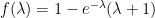
, the red line in the plot above.

Finally, why would anyone care about this question? Imagine you run a web site, and on each comment you put a time stamp, and that time stamp is the time that it was at your server at the time the comment was made. Then say someone comes by at 1:45 AM Pacific Daylight Time this morning and leaves a comment, and someone else comes along at 1:15 AM Pacific Standard Time — which is actually a half-hour later — and leaves a comment. The comments will appear to be in the wrong order, like they do here. Then f(λ) is the probability of this occuring where λ is the number of comments per hour. Alternatively, it’s the probability that given just the sequence of timestamps in local time you can work out which are the last daylight-savings-time comment and the first standard-time comment. As I said here, this is an increasing function of λ, although I am not too lazy to work it out.