How many borders between states are there in the United States?

How many borders between states are there in the United States?

Sure, you could get out a map and count them. Or you could estimate.

There are 48 contiguous states. The average state has six borders [citation needed], so that’s 288 borders, but we double-counted, so that’s 144. But we need to apply a bit of a haircut for those states that are around the edge. How many of those are there? Figure the US is roughly a 5-by-10 rectangle of states, so there are 30 states around the edge. 144 minus 30 is 114.

There are actually 109. In 1998 Thomas Holmes constructed a data set of those borders for a paper, The Effect of State Policies on the Location of Industry: Evidence from State Borders. I haven’t read the paper. It appears that it shows that there was more manufacturing activity on the “pro-business” (anti-union, has so-called right-to-work laws) side of a state border than on the “anti-business” (pro-union, doesn’t have so-called right-to-work laws) of the state border.

This method could probably also be applied with, say, mask mandates and COVID case rates. Early on in the pandemic there was some coverage of how Tennessee was doing much worse than Kentucky, although that may have been overly politicized (Kentucky has a Democratic governor, Tennessee a Republican) and may have been due to higher testing rates in Tennessee. (See Andrew Gelman’s post on the topic; it appears that data on deaths didn’t show the same gap.)

Some people like counting the borders they’ve crossed, as in this post at Twelve Mile Circle. That post includes a map by Jon Persky that gives 138 borders, but that includes 16 land crossings between contiguous US states and Canadian provinces; 8 between US states and Mexican states; two between Alaska and Canadian provinces; and three borders that can only be crossed by water (Maine – Nova Scotia, New York – Rhode Island, and Ohio – Ontario).

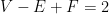
As for that fact that “the average state has six borders”, this is really a statement about planar graphs. From the map of the US, construct a planar graph by taking the 48 states as vertices and the state borders as edges. (You have a problem at Four Corners, which we’ll ignore.) Let E be the number of edges in the graph, and F its number of faces. Here a “face” corresponds to a place where three states meet, such as Pennsylvania-Maryland-Delaware or Georgia-Alabama-Tennessee. Then every edge meets two faces and, except for around the perimeter of the graph, every face has three edges, and thus 2E \approx 3F. Euler proved V - E + F = 2, which we’ll approximate as V - E + F \approx 0. Thus V - E + 2E/3 \approx 0, or rearranging E \approx 3V; the number of edges (state borders) is about three times the number of states.

This is all brought to you by Colin Beveridge’s kids asking the same question about national borders.

Riddler: a grid of numbers

From FiveThirtyEight’s “Riddler” feature: fill in this table with single-digit numbers, such that the entries in the margins are the products of the corresponding entries in the interior of the table.

294
216
135
98
112
84
245
40
889056015680055566

We start by factorizing the column products, to get 2^6 3^4 5^1 7^3, 2^7 5^2 7^2, and 2^1 3^4 7^3 respectively. Since the second-column product isn’t divisible by 3, the second column must consist of only 1, 2, 4, 5, 7, and 8. The third column isn’t divisible by 4 or 5 so it can’t contain 4, 5, or 8; furthermore it contains only a single even number (2 or 6).

We can explicitly enumerate the possibilities for each row. For example for the row with product 84 we have

expand.grid(1:9, 1:9, 1:9) %>% filter(8890560 %% Var1 == 0 & 156800 %% Var2 ==0 & 55566 %% Var3 == 0) %>%
  mutate(prod = Var1 * Var2 * Var3) %>% filter(prod == 84)

which returns the data frame

  Var1 Var2 Var3 prod
1    6    7    2   84
2    7    4    3   84
3    4    7    3   84
4    7    2    6   84
5    2    7    6   84
6    6    2    7   84
7    3    4    7   84

and so there are seven possibilities for this row. 7, 6, 2 doesn’t appear because the second column can’t contain a multiple of three.

This is actually enough to fill in a few entries, and we also can list all the possibilities for the remaining ones:

6, 776, 7294
3, 6, 94, 83, 6, 9216
3, 953, 9135
2, 72, 72, 798
2, 4, 7, 82, 4, 7, 82, 7112
2, 3, 4, 6, 72, 4, 72, 3, 6, 784
5, 75, 77245
4, 5, 84, 5, 81, 240
889056015680055566

Now the first column has product 2^6 3^4 5^1 7^3, so it must have a single 5 and three 7s. The remaining four entries have to multiply to 2^6 3^4 so they must be two 9s and two 8s. That lets us complete the first column, because there is only two possible locations for a 9, two for an 8, and one for a 5. And knowing those first-column values allows us to complete various rows:

776294
94, 83, 6216
953135
72, 72, 798
82, 72, 7112
72, 43, 684
577245
85140
889056015680055566

The third column only contains a single even number, which is enough to finish that column, and then work out the second column by arithmetic:

776294
983216
953135
72798
827112
74384
577245
85140
889056015680055566

I was honestly surprised this puzzle was solvable – I didn’t believe there was enough information at first. I think it works out because the first-column product 8890560 is large enough that we can determine uniquely what the values in the column are and only have to put them in order; the third-column only having one even value works as well.

Also, I believe this puzzle was part of the MIT Mystery Hunt that took place this weekend (which I haven’t competed in in a Very Long Time). The Riddler column was named “Can You Hunt For The Mysterious Numbers?” and it says the puzzle was by Barbara Yew, and googling that “name” finds an MIT web page at yewlabs.mit.edu for something called “MYST2021: Maturing Young Scientific Theories: Expanding Reality & You” – the first letters spell “MYSTERY”.

Critiquing some coronavirus maps

Here’s a current map of coronavirus cases from the Washington Post (retrieved Monday, January 11 at 12:30 PM Eastern time):

Washington Post map of coronavirus cases (per capita)

A friend of my wife’s pointed this out because Georgia jumps out at the eye on this map. My wife similarly noticed that Los Angeles did not look bad, recent reports of crisis there notwithstanding.

The reason is simple – Georgia has an unusually large number of counties for its size. We have 159 counties in 57,513 square miles, for an average area of 362 square miles. Compare Florida (67 counties, 53,625 square miles, average of 800 square miles per county) or Alabama (67 counties, 50,645 square miles, 756 square miles per county). There’s a belt of states stretching roughly north-northwest from Georgia on this map — Tennessee, Kentucky, Indiana, Ohio – that jumps out, and these are all among the states with the smallest average county size. Each county is represented by a circle with size proportional to its coronavirus case rate, so a state’s intensity of color is roughly (coronavirus case rate per capita) x (average county area). And average county area is larger in some parts of the countries than others, for historical reasons nicely expounded by Ed Stephan.

Average county areas by state, in square miles

The Post also has the same map with circle sizes proportional to the total number of cases per county. This, I think, looks much more like expected:

Washington Post map of coronavirus cases (total)

This fixes the issue in Los Angeles – it now has a very large circle, because Los Angeles County has ten million people. However this has the opposite problem – now low-population areas look relatively safe. For overall case rates I prefer a color-shaded map. The Post doesn’t have one, but the New York Times does. Darker/redder colors indicate higher case rates. (I’m old enough to remember when the color scale just went up to red, but not prescient enough to have captured those screen shots on a regular basis.)

New York Times map of coronavirus cases (per capita)

The Times also has a map with a circle for each county. This map isn’t directly comparable to The Washington Post map because it’s a map of the total number of cases; it uses larger circles, which has the effect of not making low-population-density states look totally unscathed by the coronavirus but at the cost of overlapping in high-population-density areas like coastal California or the Northeast corridor.

New York Times map of coronavirus cases (total)

At least to me, it seems natural to interpret the size of a circle as a raw number, and the color as a rate. Either one of the circle maps can be thought of as putting a little bit of red down near each case (recent cases in the WaPo map, all cases in the NYT). And so, if you squint, these maps don’t look all that different from population density maps, which Kieran Healy has called one of America’s ur-choropleths, because the variations in coronavirus rates are swamped by the variations in population density.

364 gifts

On Christmas Day I alluded to the fact that there are 364 gifts in the song “The Twelve Days of Christmas”. Is there a way to prove this that doesn’t require adding everything up?

As a reminder, on day k of Christmas (k = 1, 2, …, 12) the singer receives 1 of gift 1, 2 of gift 2, …, k of gift k. Christmas has 12 days. (Gift 1 is “a partridge in a pear tree”, gift 2 is “turtle doves”, and so on up to gift 12 which is “drummers drumming”, but this is irrelevant.)

So on day k there are total of 1 + 2 + \ldots + k gifts; this is k(k+1)/2 = {k+1 \choose 2}. The total number of gifts received is therefore

{2 \choose 2} + {3 \choose 2} + \cdots + {13 \choose 2}

and by the hockey-stick identity (sometimes also called the Christmas stocking identity) this is {14 \choose 3}. The identity can be proven by induction, but I prefer a combinatorial proof. Consider the subsets of \{1, 2, \ldots, 14\} of size 3 and group them according to their largest element. Then there are {k \choose 2} sets whose largest element is k+1, for each of k = 2, \ldots 13.

This suggests another identity – what if we group according to the middle element of the subset instead? For example, there are 5 × 8 = 40 3-subsets of [14] whose middle element is 6; each one has one element chosen from 1, 2, …, 5 and one element chosen from 7, 8, …, 14. More generally there are k(13-k) 3-subsets of [14] with middle element k. Thus we have

1 \times 12 + 2 \times 11 + 3 \times 10 + \cdots + 12 \times 1 = {14 \choose 3}.

In terms of the song, this is actually a natural way to count. k(13-k) is the number of gifts of type k, since such gifts get given on the last 13-k days – there are 12 total partridges in pear trees, 2 × 11 = 22 total turtle doves, 3 × 10 = 30 total calling birds, and so on until we get back down to 12 drummers drumming. (The most frequent gifts? 42 swans and 42 geese. Maybe that was the question.)

A couple tidbits of Georgia election math

As you may have heard, there are runoff elections going on in Georgia today (January 5, 2021). You don’t need me to tell you this, and it’s probably too late, but if you live in Georgia, vote.

Also the presidential election in Georgia in 2020 was very close, as you may have heard: 49.47% for Biden, 49.24% for Trump. (The law does not allow for runoffs in presidential elections.)

But here’s the surprising thing. Below are two maps of the state of Georgia. Can you spot the difference?

There is one county with a different winner in the two maps – Burke County, in the east-central part of the state. And Burke was won by Clinton in 2016 (left map), but by Trump in 2020 (right map). The only county that switched winners switched in the opposite direction of the state as a whole.

(2020 results from the state’s official election results site, map by me. 2016 results from opendatasoft, map by me.)

Furthermore, what if Georgia had an electoral college made up of counties?

Historically this is not entirely crazy; Georgia used to have something called the County Unit System for statewide primaries. In this system the largest eight counties were classified as “Urban”, the next-largest 30 counties were classified as “Town”, and the remaining 121 counties were classified as “Rural”; urban, town, and rural counties got 6, 4, and 2 votes respectively, awarded on a winner-take-all basis. This benefited rural candidates.

With current population statistics, the “urban” counties would be Fulton, Gwinnett, Cobb, DeKalb, Clayton, Chatham, Cherokee, and Forsyth. These are the county containing most of Atlanta, six suburban Atlanta counties, and the county containing Savannah; this category would better be called “suburban”.). Trump would have won 308 of the 410 county unit votes in 2020 – he won 2 of the 8 “urban” counties, 21 of the 30 “town” counties, and 106 of the 121 “rural” counties. In 2016 he would have won 310 of 410.

Unsurprisingly, a system this biased was found unconstitutional. But what if we had an electoral college? We can start with a simple calculation:

  • in 2020, Biden won 30 of 159 counties, making a total of 53.69% of the state’s population (5,643,569 in Biden counties, 4,867,562 in Trump counties)
  • in 2016, Clinton won 31 of 159 counties, making a total of 53.90% of the state’s population (5,666,008 to 4,845,123) – the difference being Burke, mentioned above.

(Populations are census estimates from the Governor’s Office of Planning and Budget; I used 2018 estimates.)

This surprised me, but upon reflection, it makes sense – the red counties in Georgia are really red. But we all know a real electoral college gives smaller units undue influence. We can simulate that by adjusting the population of each county. In 2020 Biden won counties with 776,007 more people, but he won 99 fewer counties. So if we give each county eight thousand more “people” – analogous to the electoral votes that correspond to Senators – then Trump wins this state-level electoral college. Also in this world he’d be calling county commissioners instead of the Secretary of State.

But in any case we would not be talking about Georgia “flipping” from Republicans to Democrats between 2016 and 2020. The actual flipping was caused, mostly, by Atlanta suburbs moving to the left – but they happened to do so in a way where no counties crossed over. (The flipping of Gwinnett and Cobb, the two largest purely suburban counties, already happened between 2012 and 2016.). I haven’t explored this in-depth but it’s interesting to think about how an electoral college of counties distorts state-level results as a proxy for how an electoral college of states distorts national results.

2021

2021 x 1202 = 2429242, a palindrome.

That is, when you take 2021 and multiply it by its digit-reversal, you get a palindrome.

This is rare – you (if you are young) will see it again in 2101, 2102, 2111, 2201, and then not until five-digit years. It follows from the digits in 2021 being small – according to the Encyclopedia of Integer Sequences, this is a property of integers not ending in 0 with sum of squares of digits < 10.

In general we can view an integer as a polynomial – in the case of 2021, 2x^3 + 2x + 1 – evaluated at x = 10. Call this polynomial f(x). Then its coefficient-reversal is x^{deg(f(x))} f(1/x) where deg(f(x)) is the degree of the polynomial f(x). For eample, if f(x) = 2x^3 + 2x + 1 then we get the reversal x^3 (2/x^3 + 2/x + 1) = 2 + 2x^2 + x^3. Then we can show that g(x) = latex f(x) f(1/x) x^{deg(f(x))} is its own coefficient-reversal. It has degree deg g(x) = 2 deg f(x). Upon substituting 1/x for x and multiply by x^{2 deg f(x)} we get

f(1/x) f(x) (1/x)^{deg f(x)} x^{2 deg f(x)} = f(x) f(1/x) x^{deg f(x)}$

which is g(x) itself.

Now if the coefficients of g(x) are all less than 10, we can interpret this as a fact about integers. The middle coefficient of g(x) is just the sum of the squares of the coefficients of f(x) – for example,

(x^3 + 2x + 1) (x^3 + 2x^2 + 2) = 2x^6 + 4x^5 + 2x^4 + 9x^3 + 2x^2 + 4x + 2

with middle coefficient 2^2 + 2^2 + 1^2 = 9.

For the proof that the sum of the squares is the largest coefficients, wave your hands and say “Cauchy-Schwarz”, then look at Proposition 10 of On Polynomial Pairs of Integers by Martianus Frederic Ezerman, Bertrand Meyer, and Patrick Sole.

Some other interesting properties of the number 2021: it’s a product of two consecutive primes and a value of Euler’s prime-generating polynomial. These don’t contradict each other – the polynomial n^2 + n + 41 is prime when evaluated at 0, 1, 2, …, 39, and 2021 = 44^2 + 44 + 41.