Of course 1 isn’t prime! But I think in mathematical discourse if you spell out the number you’re not referring to it directly. (This week’s posts notwithstanding, mathematical content doesn’t come up enough in crosswords to be sure what the conventions are there.) There is one prime number that is not odd, namely two.
Hopefully this post sees the light of day on Thursday; my cell service is spotty due to Zeta. Not the function having to do with primes, the storm. (I did say there would be a lot of storms.)
To get the Fibonacci numbers you start with 1 and 1, and then each number is the sum of the two before it. I’ve bolded the even numbers.
1, 1, 2, 3, 5, 8, 13, 21, 34, 55, 89, 144, …
So it’s not just some random smattering of these numbers that happens to be odd, but every third one. To see this, let’s build an addition table for odd and even numbers:
+
even
odd
even
even
odd
odd
odd
even
Addition table for even and odd numbers
Then if you start with two odd numbers, just following this gets you
odd, odd, even, odd, odd, even, …
and this will repeat itself forever. (If you started with “odd, even” or “even, odd” you’d get the same pattern, but shifted; if you start with “even, even” then the sequence stays even forever.
(The Twitter hashtag #NYTXW mostly missed this, preferring to focus on, and complain about, the fact that the puzzle was built around a too-long quote from Sex and the City.)
Note that 34 (the position of this clue in the puzzle) is a Fibonacci number. I’d like to think this was intentional.
Both have Biden ahead by 8.4 percent in the popular vote. FiveThirtyEight has 53.6 to 45.2 (with 1.2 percent to third parties), while the Economist has 54.2 to 45.8 (with no third parties – I presume they’re measuring share o the two-party vote). My assumption is that the difference in these odds is due to FiveThirtyEight’s model putting a larger correlation between states than the Economist’s, and therefore giving a wider distribution around that center point.
Both sites also have a model of the Senate election. FiveThirtyEight expects the Democrats to have 51.5 seats after the election, with a 74% chance of control; the Economist expects 52.5 seats for the Democrats, with a 76% chance of control. Recall that if the Senate is tied, 50-50, then the Vice President (Kamala Harris for the Democrats, or Mike Pence for the Republicans) breaks the tie; that is, Senate control belongs to the party holding the White House. So what do the models say about that tie?
FiveThirtyEight presents the diagram below, where the 50/50 bar is split between the parties:
If you hover over the red part of the 50-50 bar you get “1.7% chance” (of a 50-50 Senate and Republican president); if you hover over the blue part you get “11.2% chance” (of a 50-50 Senate and Democratic president). That is, conditional on a 50-50 Senate, FiveThirtyEight gives a probability of 0.112/0.129, or about 87%, of a Democratic president. (This is different from the 88% figure above.)
The Economist, on the other hand, explicitly says that conditional on a 50-50 Senate, there’s an 18% chance of a Democratic presidency:
Which one of these probabilities is more realistic? Where do they come from?
In presidential-election years, the model also simulates which party will control the vice-presidency, which casts the tiebreaking vote in case of a 50-50 split, based on the simulated national popular vote for the House.
FiveThirtyEight’s Senate forecast methodology page doesn’t seem to make a statement about this; they mention that the 2020 Senate model is “mostly unchanged since 2018”, and of course there was no presidential election in 2018.
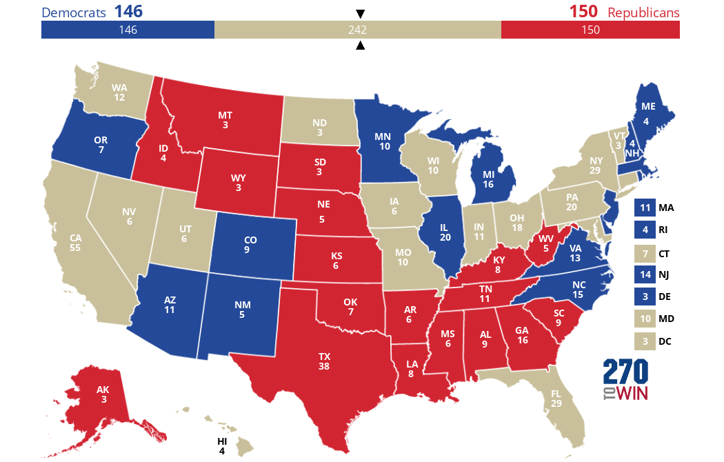
My instinct is that 50-50 is a bad night for Democrats. The Democrats start with 35 seats not up re-election. Both sites agree on the 15 most Democratic-leaning Senate seats that are up for election. So let’s say that Democrats win those 15 states and no others, for a 50-50 Senate. For the sake of argument, assume that every state that has a Senate seat up for grabs chooses the same party for the Senate and the presidency. So let’s fill in an Electoral College map with those 15 states in blue, and the nineteen other states with Senate seats at stake in red, to get the map below. (15 + 19 = 34, you say? Well, Georgia has two Senate seats at stake.)
Next let’s fill in those states that don’t have a Senate election, but are safe for one party or the other. For the Democrats, California, Washington, Hawaii, New York, Maryland, Vermont, Connecticut (and DC). For the Republicans, Utah, North Dakota, Missouri, and Indiana. (I’m old enough to remember when Missouri was a swing state.) Here’s the map you get.
So in a world where the Senate is 50-50 in what is probably the most likely way, it looks like the Democrats are right on the cusp of winning the presidency – FiveThirtyEight is probably right after all, to color the 50-50 bar mostly blue. I just hope we don’t get that 269-269 map, partially because it’ll be exhausting and partially because then I should have written a post on how a tied Electoral College gets thrown to the house instead of writing this one.
From r/dataisbeautiful by alekazam13, a chart of how many people live in regions where the zip codes start with each digit. The distribution is surprisingly uneven.
To give some context: zip codes in the US (what other countries would call “postal codes”) have five digits. The first digit corresponds to one of ten regions of the US (these regions don’t exist anywhere outside of the zip code system), the next two to a postal service sorting center, and the last two to an individual post office. There are something like 40,000 zip codes, and of course 100,000 possible ten-digit numbers. Here’s a map of the regions, public domain from Wikipedia:
Of course, ZIP codes were invented some time ago; they were introduced in 1963! So what if we use 1960 census figures? There was some imbalance, but perhaps less than there is today.
first digit
9
3
7
1
2
4
8
6
0
5
population (millions), 2019
53.5
46.8
40.6
33.2
32.9
32.7
23.8
23.7
23.7
17.3
population (millions), 1960
21.2
17.9
17.0
28.5
16.6
25.2
6.2
18.0
16.6
12.1
Distribution of population by first digit of zip code, 2019 and 1960
The population of the US right now is about 332 million; so in an ideal world you’d have 33.2 million in each bucket. If you want to divide the US into ten regions, all made up of adjacent states (we’ll make some exceptions for Alaska, Hawaii, and Puerto Rico), and it’s 1963, you run into a problem pretty quickly. The population of the US at that time was 179 million. New England (that’s the six states in yellow to the far northeast; note that New York and New Jersey are not part of New England) had 10.4 million people, not enough to plausibly call it a tenth of the country. New York (labeled “10-14” above) had 16.8 million, nearly a tenth all on its own. The only sensible decision was to skip over New York and add New Jersey. (Why New York didn’t get its own first digit but has to share with Pennsylvania, I don’t know.). The “5” and especially “8” regions had very low populations back then; these were quite rural parts of the country and I assume had more post offices per capita. But since then we figured out how to get people to live in the desert.
I suspect if the system were invented today, then, the regions would look a bit different. In particular:
California would get its own region (at 39 million, it’s fully 12% of the US population)
Texas (29 million) would get a region nearly to itself, sharing with Oklahoma (4 million)
Georgia plus Florida (11 + 21) would be a region – these are two states that have grown quite a bit since 1960.
The six New England states (15) plus New York (19) would be a region
As is usual with these sorts of things, you nibble around the edges and then there end up being lots of ways to divide the middle of the country, none of which are any good. (I tried.). The rough design criteria seem to be:
divide the country into ten sets of states of roughly equal population;
such that each region is contiguous (probably Alaska and Hawaii should be in the same regions as Washington and California?, respectively, and Puerto Rico with somewhere on the East Coast);
and such that the regions don’t “look funny”, but what does that even mean?
In other words, the criteria for forming congressional districts or similar. (Without gerrymandering.)
Ultimately with computerized sorting having a system where zip codes are “interpretable” doesn’t really matter. And the bureaucracy of the Postal Service came up with a different solution than the bureaucracy of Bell Telephone, which was inventing area codes at not all that different a time. Area codes seem random, although with the design principle that more populous areas get codes with smaller sums of digits, which took less time to dial. My understanding is that similar area codes were deliberately put far apart geographically, in order to reduce confusion. I’ve never actually seen that written down, though.
My daughter likes the book Knuffle Bunny Too: A Case of Mistaken Identity, by Mo Willems. Maybe I like it more than she does; she’s old enough to pick out her own books now, and doesn’t pick this one. One day Trixie brings her bunny to school, and it turns out that another child has the same bunny and they become friends! (The children, not the bunnies.)
I’ve read this book enough time that my mind can wander while I read it. There’s a list of names embedded in it, of the other kids that Trixie wants to show the bunny to: Amy, Meg, Margot, Jane, Leela, Rebecca, Noah, Robbie, Toshi, Casey, Conny, Parker, Brian.
So… from this list of names, can we figure out when Trixie was born?
The R package babynames is really useful for this kind of question. This is a wrapper around the Social Security Administration’s baby names data, which gives the number of births of people with each name in the US, each year, for names that were given to at least five babies. It goes from the most common baby names of 1880:
> head(babynames)
A tibble: 6 x 5
year sex name n prop

1 1880 F Mary 7065 0.07238359
2 1880 F Anna 2604 0.02667896
3 1880 F Emma 2003 0.02052149
4 1880 F Elizabeth 1939 0.01986579
5 1880 F Minnie 1746 0.01788843
6 1880 F Margaret 1578 0.01616720
to the least common male baby names of 2017:
> tail(babynames)
A tibble: 6 x 5
year sex name n prop

1 2017 M Zyhier 5 2.55e-06
2 2017 M Zykai 5 2.55e-06
3 2017 M Zykeem 5 2.55e-06
4 2017 M Zylin 5 2.55e-06
5 2017 M Zylis 5 2.55e-06
6 2017 M Zyrie 5 2.55e-06
Here’s code to generate a list of “typical” names from each year ending in 0:
Note that this isn’t the ten most common names in each year. Some names appear twice in some years (Joseph in 1900, Mary in 1920). Some rare names appear (there were only 200 babies named Nyasia born in 2010), but that’s to be expected in a random sample of names. But if you read through this list, at least if you’re American, you see an evolution from “old-fashioned” names to “normal” names to “names people are giving to their kids that sound totally weird”.
So this might be possible. We can plot the frequency of the names occurring in the relevant passage against time:
Note the use of the log scale on the y-axis; without that you just learn that everyone was naming their kids Amy and Brian in the 1970s. Names that don’t occur in the data set for a given year are assumed to occur four times, which is the line along the bottom. The Social Security program wasn’t introduced until 1937, and didn’t originally cover all workers, so data coverage is sparse for births pre-1920 or so. But we already knew Trixie isn’t that old.
The probability that 13 randomly chosen kids born in year y have those particular thirteen names is just 13! times the product of the name frequencies:
props %>% group_by(year) %>%
  summarize(n = n(), total_prob = factorial(13) * exp(sum(log(corrected_prop)))) %>%
  ggplot() + geom_line(aes(x=year, y=total_prob)) +
  scale_y_log10('probability of name set', breaks = 10^((-46):(-38))) +
  ggtitle('Probability that 13 randomly chosen newborns have\nthe names of the children from Knuffle Bunny Too')
So this set of names has the largest probability of occurring in 2000, followed by 1996, 1997, and 2003. The “right answer” is 2001, according to a 2016 New York Times profile of Mo Willems, at least if Trixie is meant to be Willems’ actual child. The book was published in 2007, and in it Trixie goes to pre-K (likely a class of ages 4 or 5); the previous book in the series was published in 2004 and in it Trixie couldn’t even “speak words” yet.
Sticky Notes is an excellent podcast about classical music, by the conductor Joshua Weilerstein. A recent episode was on Bruckner’s fourth symphony, a piece I wasn’t familiar with. In Bruckner’s work, there appears the “Bruckner rhythm”, which is two quarter notes followed by three quarter note triplets. And in musical terminology, that’s entirely correct!
But if the terminology made mathematical sense, that would be a “sixth note”, which somehow I had never realized. A few people have pointed this out (here, here, here). It seems like this is most natural to programmers creating software that has to deal with music. For example – and I can’t believe I remember this – QBasic had a PLAY command that played music through the computer speaker, specified note by note. For the main theme of the first movement of Bruckner’s fourth symphony, something like
PLAY "O3 E-4 < B-4 A-6 G6 F6 E-4"
would have played the example
Main theme of first movement of Bruckner’s fourth symphony
(That’s a tenor clef, the fourth line from the bottom is middle C.). The - represents flat, the O3 represents the starting octave, and the < represents an octave change. (I cannot guarantee this code actually works, because it’s 2020.)
The PLAY command mishandles the other tricky bit of notation, which is “dotted” notes. For example C4 is a quarter-note C. C4. is a dotted-quarter-note C, that is, one and a half times as long as a quarter-note. But C4.” is one and a half times as long as that, or 2.25x the original quarter-note. But a double-dotted note in ordinary musical notation is 1.75x as long. If I remember correctly I thought it was 2.25 because I found the PLAY command before I ran across double dots in any actual music.
Also, in music, the ordinary fact “2 + 2 = 4” becomes “3 + 3 = 5” – that is, two thirds make a fifth. Every so often on Music Stack Exchange one sees people saying musical notation and nomenclature don’t make sense, which is true if you’re coming at things fresh, but is also an example of how Stack Exchange sites get weird as you go conceptually further away from StackOverflow.
John Cook posted about the “baseball inequality“. In his formulation, if you have two lists of k positive numbers each, and $\latex d_1, \ldots, d_k$, then
.
This has the interpretation that the batting average of a team is between the batting average of the best player and that of the worst player.
This is not what I expected from the headline “baseball inequality” and the list of numbers. What I was expecting was the following. If the two lists are in numerical order, and , then
for any permutation of 1, 2, …, k. This is actually what’s called the rearrangement inequality. Its use in baseball is in setting the batting order. If you want to arrange the batting order so your team gets the most hits, then you want the players with the best batting averages (the highest y) to be earlier in the batting order and therefore get the most at-bats (the highest x). (One-line idea of proof: if any of the are out of order, you can increase the sum by putting them in order.)
Reality is a bit more complicated, because:
first, the goal of baseball is of course to get runs, not hits, so you want to count walks, and extra-base hits as well; hence sorting players by OPS (on-base percentage plus slugging percentage) should be better than sorting by batting average. (OPS doesn’t make dimensional sense because you’re adding two fractions with different denominators, but let’s ignore that.)
second, there are interactions between the players – in order to score runs you usually need to get multiple hits in close succession. Since batting orders are cyclic, you perhaps don’t want to have your worst hitter going immediately before your best hitter, and indeed some teams have tried batting the pitcher eighth. (I’m a National League fan; don’t talk to me about designated hitters.)
These are probably problems that are best solved by simulation, and I’ve got a day job.


 Click the map to create your own at
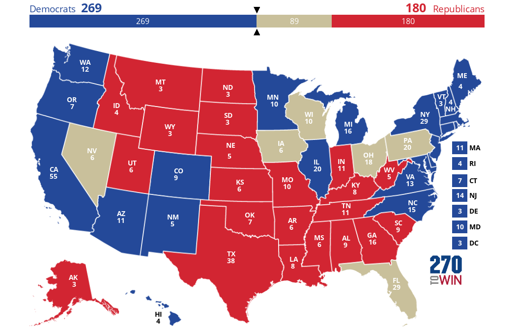


 and $\latex d_1, \ldots, d_k$, then
 .
. and
and  , then
 of 1, 2, …, k. This is actually what’s called the
  are out of order, you can increase the sum by putting them in order.)