Probability of lots of twins

Dave Radcliffe asked on Twitter: “A class of 380 students has 16 sets of twins. How likely is this to happen purely by chance?” and he links to this article. The school in question is the Staples High School in Westport, Connecticut.

Let’s assume for the sake of argument that if there are two twins, they will be in the same grade at the same school. Then we may as well treat each pair of twins as a single person for the purpose of school-enrollment purposes, and so we’re asking: out of 364 entities which are either singletons or pairs of twins, what’s the probability of at least 16 twins?

This refers to the class of 2014 at this school, so let’s figure they were born in 1996. This data brief from the CDC gives the rate of twin births in 1996 at about 27 per 1000. But that’s counted per-child. If you count per-pregnancy you should get just over half that; let’s call it 14 per 1000. The probability that a binomial(364, 0.014) random variable is at least 16 is about one in 14,000.

(The data brief, however, points out one interesting fact – Connecticut has the highest rate of twinning. Different states have quite different rates of twinning, which appear to be explained at least partially by different distributions of age and race of mothers giving birth.)

xkcd’s table of approximations

Randall Munroe’s xkcd has a table of slightly wrong equations and identities.

The table gives that the number of seconds in a year is 754 = 31640625 or (using the “RENT method”) 525,600 × 60 = 31536000. (This refers to the song Seasons of Love, which features the number of minutes in a year prominently in its lyrics.) I’ve always been partial to “pi seconds is a nanocentury” (attributed to Tom Duff), which gives π × 107 for the number of seconds in a year, but you have to know π for this to be useful.

Also, while I’m on the subject: it’s easy to remember that the circumference of the Earth is 4 × 10⁷ meters, or 40,000 kilometers; the meter was originally defined to be one ten-millionth of the distance from the North Pole to the equator through Paris. Call this C, or 2πr. The surface area of the Earth is therefore 4πr2 = C2/π, which works out to (1.6/π) × 1014 square meters; may as well let π = 3.2 for the moment and call that 5 × 10¹³. Munroe gives 698, which I suppose has some amusement value.

Less-than-weekly links for April 24

game theory used on a British game show

Using R to solve a simple numerical puzzle

A calculator that requires an approximate answer before it will give you an exact answer.

The Traveling Salesman movie, premiering in Philadelphia on June 16.

The kaleidoscopic patterns of cathedral ceilings.

From Language Log: longer reviews of wines are correlated with higher ratings (they are!) and whether baboons can tell the difference between English words and non-words (they can, but it looks like that’s because the “non-words” have different letter frequencies).

The average of all fonts

What does the average of all fonts (on one person’s computer) look like?

It turns out that overlaying letters from different fonts on each other doesn’t work too well – you get blurry results, like composite faces. But if you just take evenly-spaced points along the boundary of each letter in each font, and average them together, you get something quite readable.

I’m reminded of Metafont, which is used by TeX to specify fonts; each font is specified by a bunch of parameters, so averaging fonts becomes averaging numbers. There are some nice illustrations of this in the chapter on Metafont in Douglas Hofstadter’s book Metamagical Themas.

(via Hacker News)

Coursera

Coursera is offering free online classes from Princeton, Stanford, Michigan, and Penn, in a variety of field.

Andrew Ng is offering a course in Machine Learning, which appears to be the same class as the free Machine Learning class that was offered over the winter. I’m not sure exactly how this compares to the Stanford CS229 class but it looks interesting. It starts today and runs 10 weeks.

The pilot classes were Machine Learning, Introduction to Artificial Intelligence and Introduction to Databases (that link goes to a Stanford press release from August 2011), but Coursera is now offering classes fairly widely spread across the curriculum.

Jordan Ellenberg has written a couple interesting blog posts on the future of higher education: What, if anything, is the future of the university? and Several attacks on the previous post; see also this Crooked Timber comment thread. Cathy O’Neill suggests that online learning promotes passivity.

A practical question about non-response bias

At Berkeley student evaluations of courses and instructors are still done on paper forms; we’re supposed to do them in class on a day when attendance is good. This is why I’m not doing them today – it’s Friday, and beautiful weather, and both of those always lower attendance. Although in practice, I tend to do the evaluations on a day when having a slightly shortened class makes sense, as opposed to introducing new ideas at the end of a normal-length class.

But let’s say an instructor is only interested in having the average of their evaluations be as large as possible. Wouldn’t it make sense to do the evaluations on a day when attendance is comparatively low? On a day with high attendance you’re likely to have the marginally interested students there, who would give lower evaluations. I would assume that the students who come every day like the class more.

(This is actually testable, if you could get everyone to fill out the evaluation. You could ask students “how often did you come to class?” and compare their self-reported attendance with their evaluations of the class.)

Cross Validated thread on intro Bayesian statistics

From Cross Validated (stats.stackexchange.com, a web site which I think deserves to be better known): What is the best introductory Bayesian statistics textbook?

Some of the recommendations from this thread that I’ve seen before:

Error propagation for Atwood’s machine, by simulation

A few weeks ago I mentioned that the propagation of errors is a bit tricky. Say we want to predict the acceleration in an Atwood machine. The machine consists of a string extended over a pulley with masses at either end, of masses M and m, with M > m. The acceleration is given by

a = g{M-m \over M+m}

where g is the acceleration due to gravity, which we assume is known exactly. Let’s set g = 1, so we’ll have

a = {M-m \over M+m}.

We previously found by analytic methods that if M = 100 \pm 1 and m = 50 \pm 1, then a = (1/3) \pm 0.01
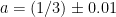
. But it’s instructive to do a simulation.

Specifically, fix some large n. For i = 1, 2, \ldots, n, let M_i be normally distributed with mean 100 and standard deviation 1; let m_i be normally distributed with mean 50 and standard deviation 1; and let a_i = (M_i-m_i)/(M_i+m_i). Then the mean and standard deviation of the a_i are estimates of the expected acceleration and its error.

This is very easy in R:


n = 10^4;
M = rnorm(n, 100, 1);
m = rnorm(n, 50, 1);
a = (M-m)/(M+m);

When I ran this code I got mean(a) = 0.3333875, sd(a) = 0.00993982. Furthermore, the computed values of a are roughly normally distributed, as shown by this histogram and Q-Q plot. (The line on the Q-Q plot passes through the point (0, mean(a)) and has slope sd(a).)

This works even if the errors are not normally distributed. For example, we can draw the simulated data from a uniform distribution with the given mean and standard deviation:


Mu = runif(n, 100-sqrt(3), 100+sqrt(3))
mu = runif(n, 50-sqrt(3), 50+sqrt(3))
au = (Mu-mu)/(Mu+mu)

I got mean(au) = 0.3332557 and sd(au) = 0.009936519. The distribution of the simulated results is a bit unusual-looking:

There’s also a way to compute an approximation to the error of the result using calculus, but simulation is cheap.

Interactive population density map

World population density visualizer, by Derek Watkins, via Metafilter and gizmodo. The original idea goes back to William Bunge‘s “Continents and Islands of Mankind”, redrawn at Making Maps. There we have a map of the areas where population density is greater than 30 per square kilometer, roughly “where people live”; Watkins adds a slider so you can change that number “30” to anything from 5 to 500.  Here’s a static map of the same data.

You should in theory be able to determine the population of the world from something like this, but the slider only goes up to 500, so you can’t tell how many people live at densities greater than 500 per square kilometer; these are “urban” densities (roughly) and so that’s a lot of people. Robert Talbert mentioned something similar on Twitter a few days ago: can you estimate the population of Colorado from a population density map? Not really, since the population of Colorado is very concentrated.