How weird is it that three pairs of same-market teams made the playoffs this year?

The Major League Baseball postseason is starting just as I write this.

From the National League, we have Washington, St. Louis, Pittsburgh, Los Angeles, and San Francisco.
From the American League, we have Baltimore, Kansas City, Detroit, Los Angeles (Anaheim), and Oakland.

These match up pretty well geographically, and this hasn’t gone unnoticed: see for example the New York Times blog post “the 2014 MLB playoffs have a neighborly feel” (apologies for not providing a link; I’m out of NYT views for the month, and I saw this back when I wasn’t); a couple mathematically inclined Facebook friends of mine have mentioned it as well.

In particular there are three pairs of “same-market” teams in here: Washington/Baltimore, Los Angeles/Los Angeles, San Francisco/Oakland. How likely is that?

(People have pointed out St. Louis/Kansas City as being both in Missouri, but that’s a bit more of a judgment call, and St. Louis is only marginally closer to Kansas City than it is to Chicago. I realize that Washington/Baltimore is also a judgment call, but ever since the Nationals set up shop in Washington the Baltimore Orioles’ owner has claimed that he’s financially harmed by the existence of the Nationals.)

Now, there are a total of five same-market pairs of teams (the others being the two New York teams and the two Chicago teams). There are two pairs (New York and Washington/Baltimore) involving teams in the Eastern division of their respective leagues; one pair (Chicago) involving teams in the Central division; and two pairs (SF/Oakland and Los Angeles) involving teams in the Western division. The way the baseball playoffs work currently is this:

  • there are thirty teams, divided into two leagues; each has three divisions (East, Central, West) of five teams each.
  • in each division, the team with the best record makes it to the playoffs.
  • in each league, the two teams among the non-winners with the best record also make it to the playoffs.

(I know, there’s some debate about whether the wild card game is “really” a playoff game. Let’s ignore that.)

This is starting to sound just asymmetric enough that I’d only figure out the answer manually if I were assigning it to a class. I don’t teach any more. Let’s simulate!

Here’s some R code. The way this works is as follows:
– the function pick.teams.from.league returns five integers in the range 1, 2, …, 15, intended to correspond to the teams that make the playoffs from one league. The East division is represented by the numbers 1 through 5; the Central, 6 through 10; the West, 11 through 15.
– we encode teams that share a market as 1, 2, 6, 11, 12, which are chosen so there’s the right number of them in each division.
– the function pick.playoffs returns the number of pairs of same-market teams who make it to the playoffs in a simulated season. These are just numbers in the set {1, 2, 6, 11, 12} that appear in both the NL and AL lists for a given season.

same.market.teams = c(1, 2, 6, 11, 12)

pick.teams.from.league = function(){
east.winner = sample(1:5, 1)
central.winner = sample(6:10, 1)
west.winner = sample(11:15, 1)
nonwinners = setdiff(1:15, c(east.winner, central.winner, west.winner))
wild.cards = sample(nonwinners, 2)
return(c(east.winner, central.winner, west.winner, wild.cards))
}


pick.playoffs = function(same.market.teams){
nl.teams = pick.teams.from.league()
al.teams = pick.teams.from.league()
matches = intersect(intersect(nl.teams, al.teams), same.market.teams)
return(length(matches))
}

Then we simulate a million seasons:

table(replicate(10^6, pick.playoffs(same.market.teams)))

Output:

0 1 2 3 4 5
534618 380675 79075 5521 111 0

So in a million simulated seasons: 5521 of them (0.55%) had three same-market pairs make the playoffs (like this year), and 111 of them (0.01%) had four. Never did all five pairs of same-market teams make the playoffs.

Of course this ignores the fact that perhaps not all teams are equally likely to make the playoffs. Maybe large-market teams are more likely to make it, because baseball is generally a regional sport (people don’t follow the league so much as they follow their team). Maybe sharing a market hurts teams. Maybe it helps – you do better because you have competition for the entertainment dollar. Who knows?

But in short, yes, this year is unusual.

Power laws and wealth

From Alison Griswold at Slate, reporting on the Wealth-X and UBS billionaire census (warning: obnoxious auto-playing music at the second link): “The typical billionaire has a net worth of $3.1 billion.”

Does “typical” mean mean? or median? It appears that “mean” is intended, because the front page of this census says there are 2,325 billionaires globally, with a combined net worth of 7.3 trillion dollars; the quotient is just around 3.1 billion.

Furthermore, wealth supposedly follows a Pareto distribution – the number of people wealthier than x is proportional to x^{-\alpha}. (But note that this may not be true; in general identifying power laws is tricky. But let’s play along, and observe that:

  • the median of a Pareto distribution is x_m 2^{1/\alpha}. Let x_m = 1 (i. e. measure money in units of billions of dollars) and you get that alpha = log(2)/log(3.1) \approx 0.61 , if “typical” means median.
  • the mean of a Pareto distribution is \x_m (\alpha/(\alpha-1)), so you get \alpha/(\alpha-1) = 3.1, or $\alpha = 31/21 \approx 1.48$, if “typical” means mean.

These two parameters are very different! In particular, with the parameter \alpha = 1.48 (derived from assuming the mean billionaire has a net worth of 3.1 billion), 81 percent of billionaires have less net worth than what the article calls the “typical” billionaire, and the median billionaire has a net worth of “only” 1.6 billion. In contrast, a Pareto distribution with \alpha < 1, such as any one where the median is at least twice the minimum, doesn’t even have a well-defined mean. (Of course the actual distribution of billionaire net worths has a well-defined mean, whatever it is, because there are a finite number of them.)

The original survey also mentions that there’s a “wealth ceiling” around 10 billion USD; see the plot at quartz. But I don’t see any really clear evidence for this. There could be such a ceiling, though, a function of the size and growth rate of the world economy, the typical length of human lives, tax rates on the income of the very wealthy, and so on.

DC statehood, 51-star flags, and models of what will pass Congress

Is D. C. Statehood a matter of civil rights?, by Andrew Giambrone in The Atlantic

I know, what does this have to do with math?

Well, you could read Chris Wilson’s article for Slate on Puerto Rico statehood back in 2010, in which he writes about possible flag designs; we’d probably end up going with alternating rows of nine and eight stars, one of the options Skip Garibaldi identified.

But what I’m actually writing about is what I saw when I followed the link in that article to the govtrack.us page on the New Columbia Admission Act. This gives the following prognosis: “64% chance of getting past committee,
17% chance of being enacted.”
(Disclaimer: govtrack.us is the work of Joshua Tauberer, who I knew in grad school, in the sense that we had some mutual friends and have been in the same room at the same time.)It turns out this comes from logistic regression models, trained on the 2011-2013 Congress. The linked page there explains the models, and gives a list of the features looked at and their weights. There are models for both getting out of committee and being enacted.  Somewhat amusingly, the feature with the highest positive weight in both of these “Title starts with ‘To designate the facility of the United States Postal'”, which refers to bills like this one that name post offices. In the particular case of this bill the prognosis comes from some more substantial features, though, having to do with sponsorship and committee membership and the like.

Note that the model doesn’t look at the text of the bill.  And it need not – we already have sophisticated textual analysis modules in the guise of Congresspeople and their staffs.  In looking at sponsorship data, this is an example of an ensemble model, which combines multiple models (the individual Congresspeople).
govtrack.us also offers analyses of ideology of Congresscritters (based on cosponsorship, using singular value decomposition) and leadership (based on cosponsorship again, using PageRank). As always, it’s good to see these statistical techniques being used to analyze things that matter.

A list of fifteen books that make up Gardner’s “canon”

I know I can’t be the only person who’d like to see this: a list of the fifteen books that make up Martin Gardner’s body of Scientific American columns.  I’ve been thinking for a while that I’d like the full set – I had a couple of the books when I was young and liked them quite a bit – but had been hampered by trying to find the whole list

The first four have been reissued by the MAA (the site I linked to, martin-gardner.com, has three, but The Unexpected Hanging and Other Mathematical Diversions, the fourth book, has been rereleased very recently as Knots and Borromean Rings, Rep-Tiles, and Eight Queens: Martin Gardner’s Unexpected Hanging, part of the MAA’s series of rereleases.  I don’t know if they intend to get through the whole set; Gardner updated them with some new information, so what will happen after his death?

Language Log on “specificity” and “sensitivity”

Language Log on “specificity” and “sensitivity” as (poorly chosen words for) properties of medical tests. Mark Liberman asks: why not just call them true positive rate and true negative rate. With the classic “what’s the probability that you got the disease, given that you tested positive?” problem thrown in; you’ve seen this if you ever learned Bayes’ theorem.

Explaining banding in a scatterplot of Goldbach’s function

David Radcliffe asks for an explanation of the “bands” in the scatterplot of the number of solutions to p + q = 2n in primes. To give an example, we have

2 × 14 = 28 = 23 + 5 = 17 + 11 = 11 + 17 = 5 + 23
2 × 15 = 30 = 23 + 7 = 19 + 11 = 17 + 13 = 13 + 17 = 11 + 19 = 7 + 23
2 × 16 = 32 = 29 + 3 = 19 + 13 = 13 + 19 = 3 + 29

and so, denoting this function by f, the elements of this sequence corresponding to n = 14, 15, 16 are f(14) = 4, f(15) = 6, and f(16) = 4 respectively. (Note that the counts here are of ordered sums, with 23 + 5 and 5 + 23 both counting; if you use unordered sums everything works out pretty much the same way, since every sum except those like p + p appears twice and I’m going to talk about ratios and inequalities and the like.)

My re-rendering of something similar to the original scatterplot is here:

plot-1

and there are heuristic arguments that f(n) \approx n/(log(n)^2))
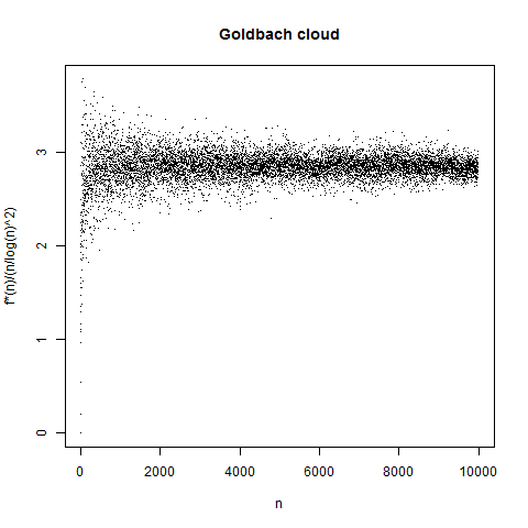
, so let’s divide by that to get a plot of the “normalized” number of solutions:

plot-2

There are definitely bands in these plots. Indeed the situation for n = 14, 15, 16 is typical: f(n) “tends to be” larger when n is divisible by 3 than when it isn’t. A handwaving justification for this is as follows: consider primes modulo 3. All primes (with the trivial exceptions of 2 and 3) are congruent to 1 or 5 modulo 6, and by the prime number theorem for arithmetic progressions these are equally likely. (For some data on this, see Granville and Martin on prime races, which is a nice expository paper.) So if we add two primes p and q together, there are four equally likely cases:

  • p is of form 3n+1, q is of form 3n+1, p+q is of form 3n+2
  • p is of form 3n+1, q is of form 3n+2, p+q is of form 3n
  • p is of form 3n22, q is of form 3n+1, p+q is of form 3n
  • p is of form 3n+5, q is of form 3n+2, p+q is of form 3n+1

So if we just add primes together, we get multiples of three fully half the time, and the remaining half of the results are evenly split between integers of forms 3n+2 and 3n+1.

We can make the bands “go away” by plotting, instead of f(n)
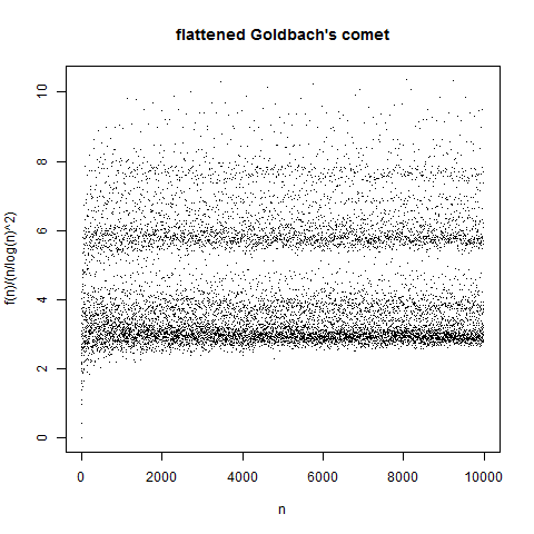
, the function which is f(n)/2 when n is divisible by 3 and f(n) otherwise. Call this f_3(n). But there’s still some banding:

plot-3

Naturally we look to the next prime, 5. A given prime is equally likely to be of the form 5n+1, 5n+2, 5n+3, or 5n+4; if we work through the combinations we can see that there are 4 ways to pair these up to get a multiple of 5, and 3 ways to get each of the forms 5n+1, 5n+2, 5n+3, 5n+4. So it seems natural to penalize multiples of 5 by multiplying their $f(n)$ by 3/4; the banding then is even less strong, as you can see below.

plot-3b

The natural thing to do here is to just iterate over primes. For the prime p we get that there are p-1 ways to pair up residue classes 1, 2, \ldots, (n-1) \pmod p to get the residue class 0 (i. e. multiples of p) and p-2 ways to get each of the classes 1, 2, \ldots, n-1. That is, multiples of 2p are more likely than nonmultiples to be sums of randomly chosen primes, by a factor of (p-1)/(p-2). Correcting for this, let’s plot x against

f^*(n) = f(n) \times \left( \prod_{p|n} {p-2 \over p-1} \right);

in this case you get the plot below. The lack of banding in this plot is basically the extended Goldbach conjecture.

plot-4

Although I didn’t know this when I started writing, apparently this is known as Goldbach’s comet: see e. g. Richard Tobin or Ben Vitale or this MathOverflow post.

And although this is a number-theoretic problem, much of this is an exercise in statistical model fitting; I proceeded by making a plot, checking out the residuals compared to some model to see if there was a pattern, and fitting a new model which accounted for those residuals. However, in this case there was a strong theory backing me up, so this is, thankfully, not a pure data mining exercise.

When does fall really start?

This year the autumnal equinox – which marks the point when the sun crosses the celestial equator – falls on September 22 in the United States (10:29 PM Eastern time, and earlier for the other time zones.) People seem to refer to this as the “first day of fall”.

But this is the astronomical definition. Meterologists define summer as June through August, and fall as September through November (so it’s been fall for a while now). I noticed this this morning when on my local news they were talking about today as the “last full day of summer” in reference to the weather. But if summer is to be defined meteorlogically, we can take a look at the climate normals for Georgia (thanks to Golden Gate Weather). (I’m using Atlanta Hartsfield Airport here.) The hottest days of the year are July 16 through 19, with an average high of 89.3 degrees, in agreement with NOAA’s warmest day of the year map. If we want a period of three months that’s the hottest possible, we should find two days three months apart which have the same normal high temperature; these are June 7 and September 7. This is the period of the year where the average high temperature is above 85 degrees.

We could find “winter” the same way; a three-month winter in Atlanta would be November 27 through February 27, when average highs are below 59.5 degrees. Fall and spring are intermediate between those. However, in snowy places I’d be a bit more inclined to define winter as “the time when it snows a lot”. You may recall that Atlanta is not a snowy place.

The benefit of thinking of things this way is that it captures the insight that seasons come “late” or “early” in certain places. Take for example a San Francisco summer; late September is actually the hottest time of year in San Francisco. Indeed the warmest three-month period in San Francisco is August 2 through November 1 (when highs are 66.7 or higher), which corresponds with my intuition that July just isn’t summer there. The coldest three-month period is November 23 through February 23 (when highs are 61.1 or lower). In other words, fall in San Francisco is a few weeks in November, and spring lasts nearly half the year. San Francisco, by the way, is less snowy than Atlanta.

For climate charts that are prettier than anything I could make on the fly, see WeatherSpark for Atlanta and San Francisco. These dates that I’ve given roughly correspond with the “cold season” and “warm season” they report, although not exactly because they don’t appear to have constrained the lengths of those periods.

How the 538 model works

Here’s a explanation by Nate Silver of how his Senate prediction model works. 10,000 words, and denser than the typical FiveThirtyEight post, but it’s food for thought if you’ve been curious about what’s going on under the hood of FiveThirtyEight’s flagship product.

Make sure to click through to the footnotes – lots of links to subsidiary analyses from the past that explicate some of the interesting tidbits Silver and co. have built up over time.

A data scientist is…

My wife sent me this tweet by David M. Wessel this morning. It’s a photograph of a presentation slide giving three definitions of data scientists:

“A data scientist is a statistician who lives in San Francisco.
Data science is statistics on a Mac.
A data scientist is someone who is better at statistics than any software engineer and better at software engineering than any statistician.”

Now, at my last job I lived in San Francisco, used a Windows machine, and was called a “quantitative analyst”. Now I live in Atlanta, use a Mac, and am called a “data scientist”.

(Oh, yes. I forgot to mention that. In the turmoil of a cross-country move blogging fell by the wayside. I’m hoping to get back in the habit.)

My conclusion (n = 1) is that the “uses Mac” variable has a higher weight than the “lives in San Francisco” variable. This may actually be true; a lot of data scientists are using Unix tools and those in general integrate better with Macs.

A final question: where are these quotes originally from?

It looks like the Mac quote is from big data borat in August 2013.

The last quote (slightly rephrased) is probably due to Josh Wills in May 2012.

In a Quora answer from January 2014, Alon Amit attributes the San Francisco quote to Josh Wills, who says he was riffing on nivertech saying “”Data Scientist” is a Data Analyst who lives in California.” Most of the google hits for this quote are from January through March of 2014 but I feel like I heard it earlier; can anyone find a better citation?