Every evening I compute an approximate second derivative. It comes from the data at the COVID Tracking Project. Specifically, it’s

where 

(5884053 – 5595343) – (5595343 – 5282758) = 288710 – 312585 = -23875.
Who would have thought 288 thousand cases in a week would seem good? But derivatives matter. That would have been terrifying on June 29 (282k cases from June 22 – 29; 194k cases from June 15 – 22). But now it feels like a reason for maybe a little bit of hope.
The most hopeless plots, I think, are the cumulative ones. The number of positive tests never goes down. Early on in all this we all wanted to “flatten the curve”… some people seemed to be referring to this curve, which could never be flat.

What we want to know is how many new cases there are. How much should we worry right now? A lot, it seems. But less than before?

And there is something heartening about seeing a negative number. If we plot the approximate second derivative, we can get negative numbers!
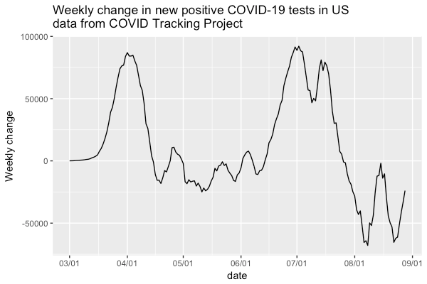
Here we can see, broadly, four phases: the growth of March and early April; the slow decline that lasted through mid-June; the “second wave” of late June and July; the decline of August.
But what’s not visible here is the terror of the fast growth of March, because that was growth from a low base. If we plot the growth rate
$latex {(P(t) – P(t-7)) – (P(t-7) – P(t-14)) \over P(t)
then the original terror is clear.

This was the period of doubling times, when cases were doubling multiple times a week. I’ve suppressed the growth rates over 100 percent per week – for example there were 44867 new cases in the US between March 16 and 23, compared to 5744 between March 9 and March 16, nearly three doublings in a week. Those days were, quite literally, off the charts.
