Here’s a current map of coronavirus cases from the Washington Post (retrieved Monday, January 11 at 12:30 PM Eastern time):
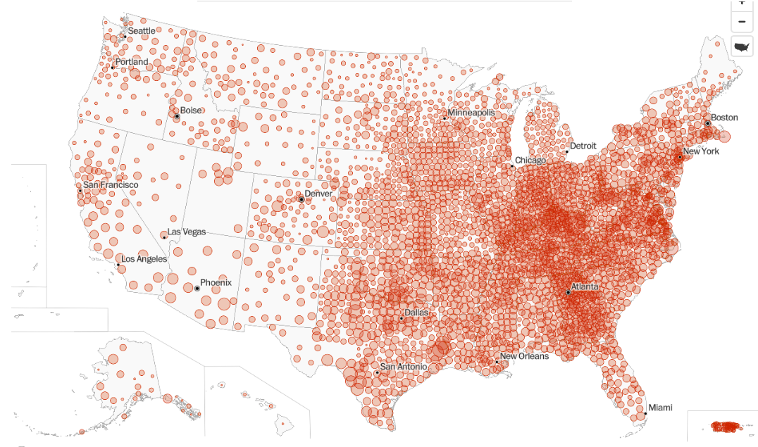
A friend of my wife’s pointed this out because Georgia jumps out at the eye on this map. My wife similarly noticed that Los Angeles did not look bad, recent reports of crisis there notwithstanding.
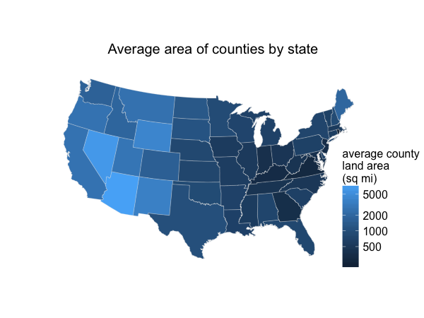
The reason is simple – Georgia has an unusually large number of counties for its size. We have 159 counties in 57,513 square miles, for an average area of 362 square miles. Compare Florida (67 counties, 53,625 square miles, average of 800 square miles per county) or Alabama (67 counties, 50,645 square miles, 756 square miles per county). There’s a belt of states stretching roughly north-northwest from Georgia on this map — Tennessee, Kentucky, Indiana, Ohio – that jumps out, and these are all among the states with the smallest average county size. Each county is represented by a circle with size proportional to its coronavirus case rate, so a state’s intensity of color is roughly (coronavirus case rate per capita) x (average county area). And average county area is larger in some parts of the countries than others, for historical reasons nicely expounded by Ed Stephan.
The Post also has the same map with circle sizes proportional to the total number of cases per county. This, I think, looks much more like expected:

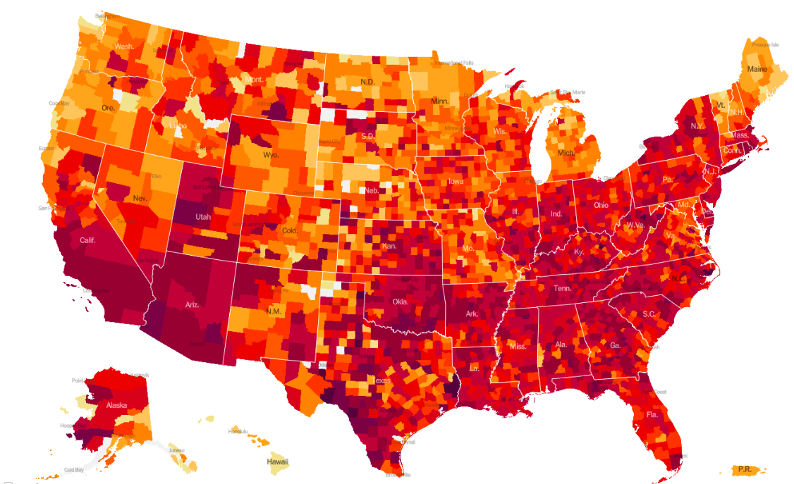
This fixes the issue in Los Angeles – it now has a very large circle, because Los Angeles County has ten million people. However this has the opposite problem – now low-population areas look relatively safe. For overall case rates I prefer a color-shaded map. The Post doesn’t have one, but the New York Times does. Darker/redder colors indicate higher case rates. (I’m old enough to remember when the color scale just went up to red, but not prescient enough to have captured those screen shots on a regular basis.)

The Times also has a map with a circle for each county. This map isn’t directly comparable to The Washington Post map because it’s a map of the total number of cases; it uses larger circles, which has the effect of not making low-population-density states look totally unscathed by the coronavirus but at the cost of overlapping in high-population-density areas like coastal California or the Northeast corridor.

At least to me, it seems natural to interpret the size of a circle as a raw number, and the color as a rate. Either one of the circle maps can be thought of as putting a little bit of red down near each case (recent cases in the WaPo map, all cases in the NYT). And so, if you squint, these maps don’t look all that different from population density maps, which Kieran Healy has called one of America’s ur-choropleths, because the variations in coronavirus rates are swamped by the variations in population density.
